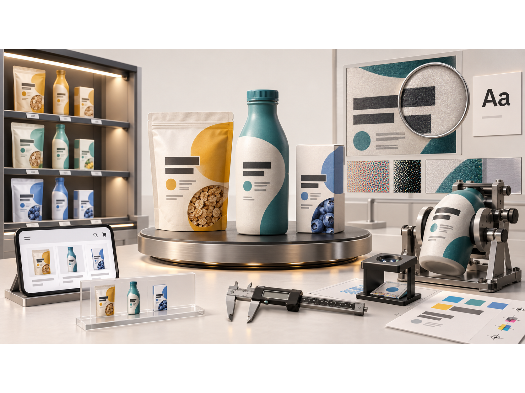
Packaging typography has to do several jobs at once. It must help a shopper identify the product and variant, make useful information findable, meet the rules that apply to the category, and remain readable after printing. A font that looks distinctive in a presentation may fail when its smallest letters are printed on a curved bottle or reduced to an e-commerce thumbnail.
The stakes are visible in U.S. food shopping data. In a weighted online survey of 1,000 U.S. adults conducted in March 2026, 79% said they checked nutrition information on food and beverage packages at least sometimes while grocery shopping. That is self-reported information use, not evidence that a particular typeface increases purchases. The useful design question is whether the package makes the information people seek easy to locate and read.
What packaging typography includes
Typography is not only the logo or the headline on the front panel. It is the hierarchy created by typeface, printed letter height, weight, spacing, alignment, contrast, and location across the entire pack.
Typographic job | Typical content | What the design should make possible |
|---|---|---|
Identification | Brand, product name, category | Recognize what the item is without relying on imagery alone. |
Differentiation | Flavor, scent, formulation, pack count | Distinguish adjacent variants at shelf and thumbnail size. |
Decision support | Key attributes, quantity, usage cues | Find the facts relevant to comparison without confusing them with promotional claims. |
Required information | Nutrition Facts, ingredients, warnings, business information, as applicable | Read the correct content in the required place and format for that product category. |
Post-purchase use | Directions, storage, handling information | Follow the product's instructions under normal conditions of use. |
These are design roles, not a regulatory ranking. A category-specific label review determines which statements must appear and how.
Consumer data: which information gets checked?
The 2026 IFIC survey provides a useful starting point for packaged food and beverage teams. It surveyed 1,000 U.S. adults online on March 13–20, 2026, and weighted responses to improve proportionality. The report states an approximate 95% margin-of-error equivalent of ±3.1 percentage points and discloses an unrestricted grant from the Consumer Brands Association. Results are self-reported; they do not measure actual in-store reading or isolate typography's effect.
Table 1. How often respondents said they checked nutrition information on food and beverage packages while grocery shopping (n = 1,000).
Response | Share of respondents |
|---|---|
Always | 21% |
Often | 26% |
Sometimes | 32% |
Rarely | 13% |
Never | 7% |
Do not grocery shop | 1% |
The percentages in Table 1 represent different frequency responses, not an experiment comparing package designs. “At least sometimes” is the sum of always, often, and sometimes: 21% + 26% + 32% = 79%. Source: IFIC, survey question 2.
Table 2. Information respondents said they looked for on food and beverage packages while grocery shopping (n = 1,000; select all that apply).
Information selected | Share of respondents |
|---|---|
Calories | 45% |
Total sugars | 44% |
Protein | 42% |
Sodium | 41% |
Added sugars | 39% |
Vitamins and minerals | 31% |
Total fat | 30% |
Ingredients list | 30% |
Total carbohydrate | 29% |
Serving size | 27% |
Cholesterol | 23% |
Saturated fat | 22% |
Trans fat | 21% |
Dietary fiber | 20% |
Do not check nutrition or ingredient information | 9% |
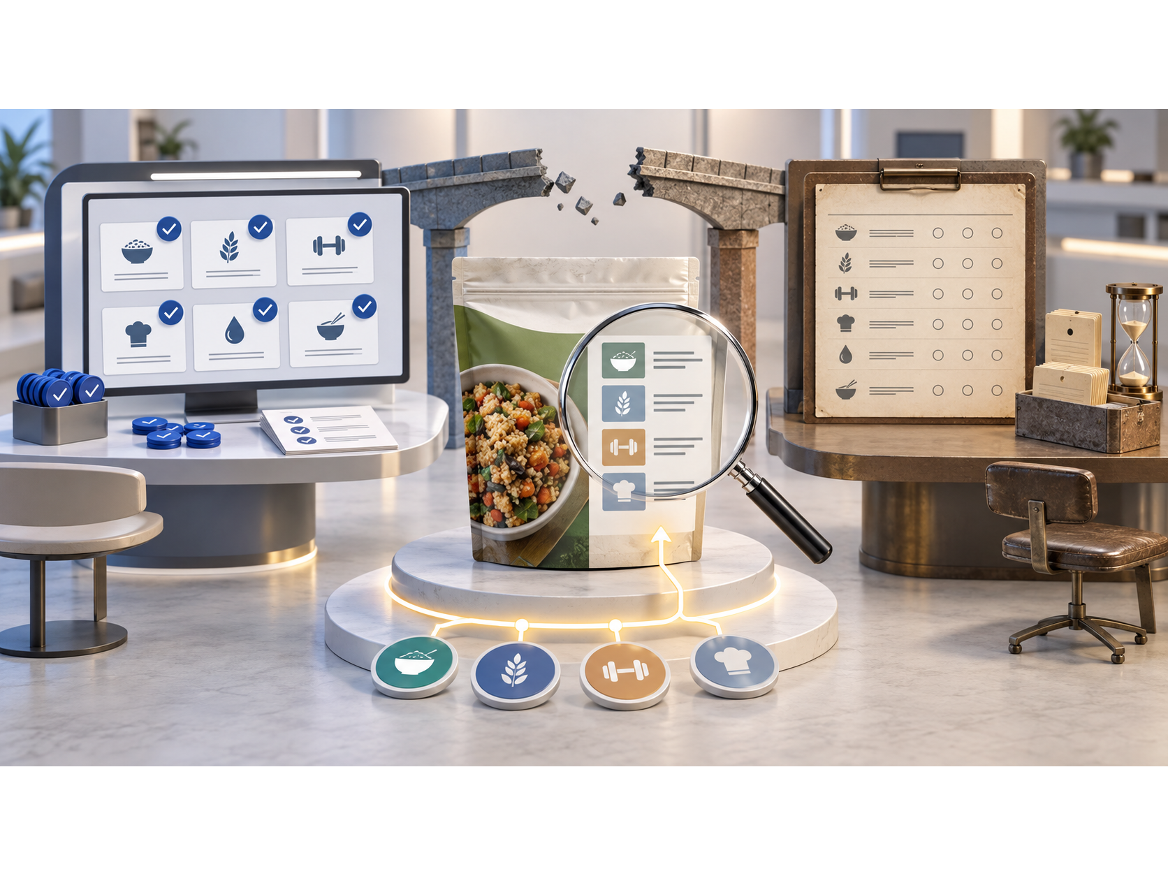
Because Table 2 comes from a multiple-selection question, its percentages must not be added to 100%. It also does not imply that lower-ranked information is optional or less important to every shopper. For a brand, the practical implication is to test whether the information relevant to its category can be found without requiring shoppers to decode a dense block of small type. Source: IFIC, survey question 4.
An earlier FDA Food Safety and Nutrition Survey reported that 87% of respondents had ever looked at the Nutrition Facts label. That survey collected approximately 4,400 responses in October–November 2019. Its question and study design differ from IFIC's 2026 shopping-frequency question, so the two figures should not be plotted as a trend.
What controlled typography research can—and cannot—tell us
Research on the typography itself is narrower than the U.S. survey above. One original study tested visual designs for spice pouches with Croatian adults. Its online experiment compared a sans-serif face with a handwritten face under three ingredient-image conditions; a second laboratory experiment evaluated perceived legibility and expected product quality. These are responses to particular mock-ups, not U.S. market shares or measured sales effects.
Table 3. Results from one spice-packaging typography study.
Test and sample | Sans-serif result | Handwritten result | Statistical result | What it does not prove |
|---|---|---|---|---|
Online choice, no ingredient image; n = 154 | 55.8% chose it for higher expected quality | 44.2% | p = 0.171 | No statistically significant typeface effect in this condition. |
Online choice, ingredient photo; n = 154 | 66.9% | 33.1% | p < 0.001 | Not a general preference for sans-serif packaging. |
Online choice, ingredient illustration; n = 154 | 70.1% | 29.9% | p < 0.001 | Not evidence of actual purchases. |
Lab-rated name legibility; n = 60 | Mean 6.65 / 7 | Mean 4.48 / 7 | p < 0.001 | Ratings concern the two specific typefaces tested. |
Lab-rated expected quality; n = 60 | Mean 5.00 / 7 | Mean 4.28 / 7 | p < 0.001 | Expected quality is not objective product quality. |
The same 154 online participants evaluated all three image conditions; these are not three independent samples. The study used Arial and Brush Script MT. Its most useful lesson is context dependence: the typeface difference was not significant without an ingredient image in the online choice task. The researchers also noted that packaging was viewed on-screen and only two typefaces were tested. A U.S. CPG brand should therefore test candidate designs in its own category, with its actual product names and visual system, rather than adopt “always use sans-serif” as a rule. Source: Kovačević et al., 2022, Tables 1 and experiment II.
Turn the evidence into a usable type hierarchy
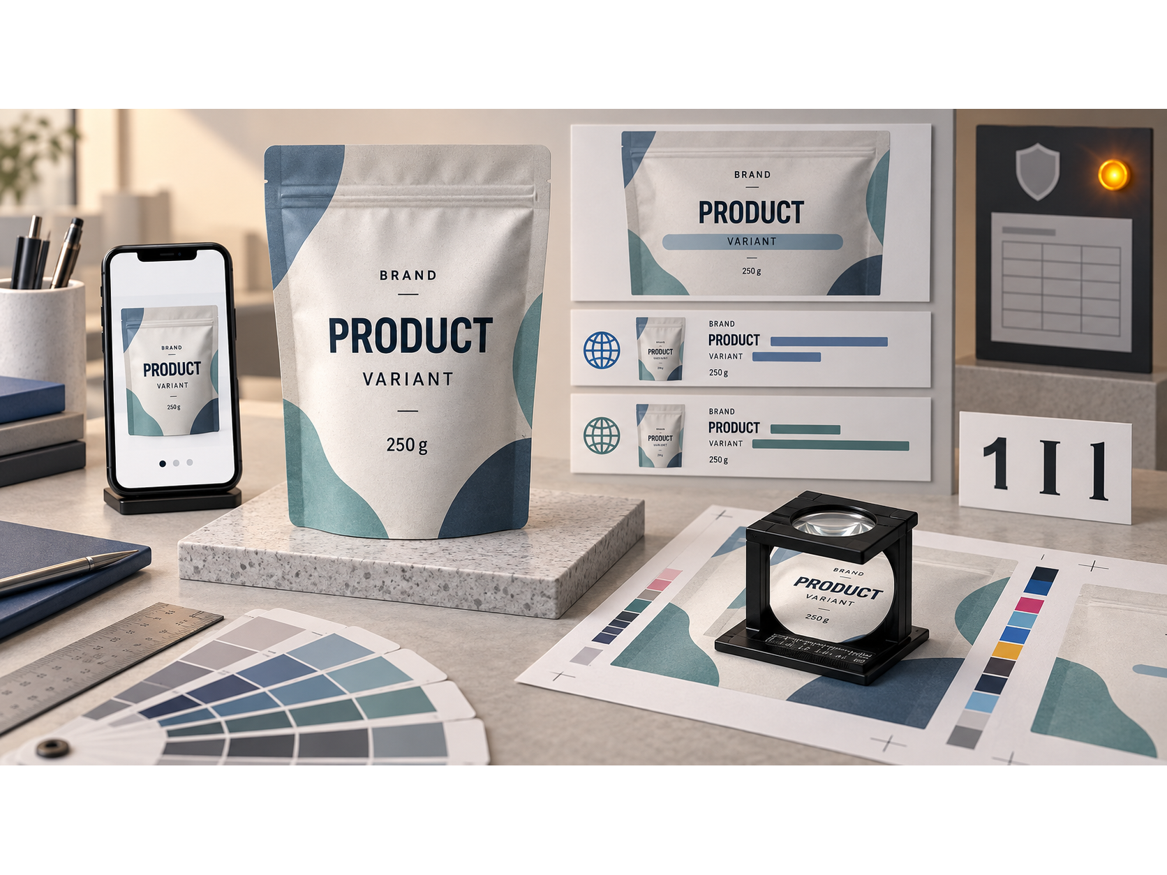
A practical type system gives display lettering and functional lettering different jobs. The display face can carry personality; functional text needs to stay unambiguous at the final size. Test long variants, numbers, multilingual copy where relevant, and easily confused characters such as “1,” “I,” and “l.”
For the front panel, ask an unfamiliar reader to identify brand, product, variant, and quantity from a realistic pack image. GS1's voluntary Mobile Ready Hero Images guideline frames these as the “4Ws”: who, what, which, and how much. The guideline addresses small-screen retail presentation; it does not replace physical-label requirements or a retailer's own image specifications.
The most important limitation is that a good hierarchy is not a legal clearance. Design choices about which words are visually dominant must be reviewed alongside required declarations and claims.
U.S. label rules: there is no single universal “minimum font size”
U.S. label requirements differ by product and declaration. The numbers below are selected examples, not a complete compliance matrix for all CPG categories. “PDP” means principal display panel. Inches refer to specified printed letter height, while pt refers to a typographic point-size requirement; the two are not interchangeable.
Table 4. Selected U.S. typographic requirements for FDA-regulated foods and cosmetics.
Product / declaration | Selected requirement | Important boundary |
|---|---|---|
Packaged-food information covered by 21 CFR §101.2 | Required information on the PDP or information panel must generally use letters or numbers at least 1/16 in. high (about 1.59 mm), unless an applicable exception is established. | This is printed character height, not a blanket “4.5-pt font” rule. Placement and conspicuousness also matter. |
Standard food Nutrition Facts format under 21 CFR §101.9(d) | In the standard format, “Calories” is at least 16 pt and the calorie number at least 22 pt; the regulation also specifies other type sizes, weights, leading, and formats. | The section contains exceptions and alternative formats, including provisions for small packages. Do not apply these two figures to every label element. |
Cosmetic ingredient declaration in the FDA Cosmetics Labeling Guide | Generally 1/16 in. high; 1/32 in. (about 0.79 mm) may be allowed when available labeling surface is under 12 sq. in. | The available-surface calculation and placement rules must be checked for the specific container. |
Cosmetic net-contents declaration on the PDP in the FDA Cosmetics Labeling Guide | Minimum printed height: 1/16 in. for PDP ≤5 sq. in.; 1/8 in. for >5–25; 3/16 in. for >25–100; 1/4 in. for >100 sq. in. | Certain container and display-card circumstances change how the panel is determined. |
For food, 21 CFR §101.15 also identifies small or stylized type, poor contrast, obscuring graphics, and crowding as reasons required statements may lack prominence. The FDA's Nutrition Facts redesign deliberately increased and bolded selected information to make the hierarchy clearer. Passing a dimensional minimum does not automatically make a label easy to read.
As of this article's September 2026 research date, the FDA's front-of-package Nutrition Info box remained a proposed rule, not a universal current requirement. The FDA's rulemaking agenda listed a final rule as a future deliverable. Check its status again before publication or redesign.
Claims deserve a separate review. The FTC's disclosure guidance emphasizes prominence, presentation, placement, and proximity when a disclosure is needed to prevent a misleading advertising impression. Tiny qualifying text far from a prominent claim should not be assumed to fix it.
Prove the typography in print and on a phone
Approval of a large digital mock-up is not approval of the finished pack. Fine strokes, reversed-out text, substrate texture, curvature, finish, and registration can change readability. Adobe's trapping guidance specifically warns that mixed process colors in small text can become hard to read when registration is imperfect. Ask the printer or converter to review the file and confirm what its process can reproduce; do not borrow an unverified “minimum size” from another substrate or press.
Table 5. A cross-functional packaging typography approval matrix.
Check | Evidence to review | Suggested owner | Pass condition to define before approval |
|---|---|---|---|
Front-panel hierarchy | Actual-size mock-up beside category competitors | Brand / design | New viewers correctly identify product and variant. |
Required declarations | Final copy on the correct panels; measured printed letter heights | Regulatory / legal | Category-specific placement, wording, size, and prominence approved. |
Physical readability | Production-representative proof on intended substrate and finish | Packaging / printer | Critical copy remains readable under normal handling and lighting. |
Print reproduction | Small type, reversed type, fine strokes, color registration, folds and seams | Printer / converter | Approved tolerances and proof match the production method. |
Digital shelf | Product image reduced to realistic mobile listing size | E-commerce / brand | Brand, product, variant, and quantity remain identifiable or are presented appropriately within the listing. |
Change control | SKU list, artwork version, claims, type specifications | Packaging operations | Any change that affects copy, panel size, substrate, or method triggers the relevant recheck. |
Table 5 is a recommended workflow, not a published regulation or a universal pass–fail standard. Define measurable acceptance criteria for the actual product before testing.
What this means for CPG leaders
Treat typography as shared packaging infrastructure. Brand teams should define the recognition hierarchy; regulatory teams should validate category-specific statements and claims; production teams should prove the design on the intended material; and e-commerce teams should test the reduced image. A launch is better served by one coordinated review than by a late request to “make the legal copy fit.”
The decision rule is simple: design for recognition, measure for compliance, and prove for production. Survey data explains why information access matters, but only testing the specific package can establish whether its typography works for its shoppers and channels.