

The Brand
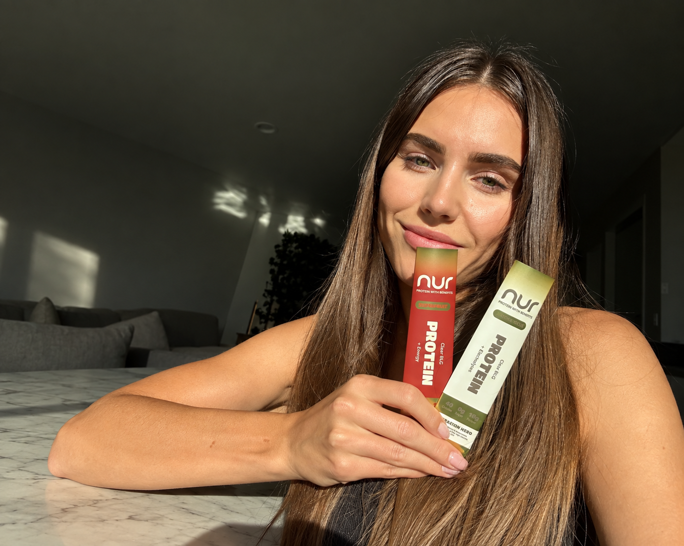
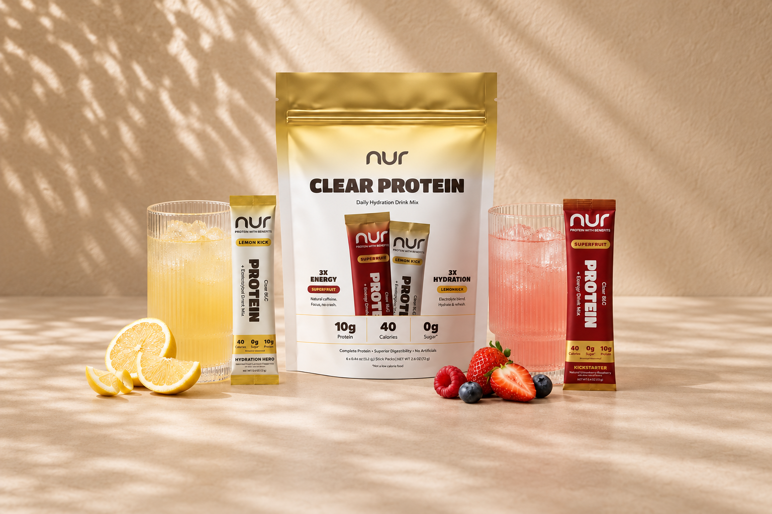
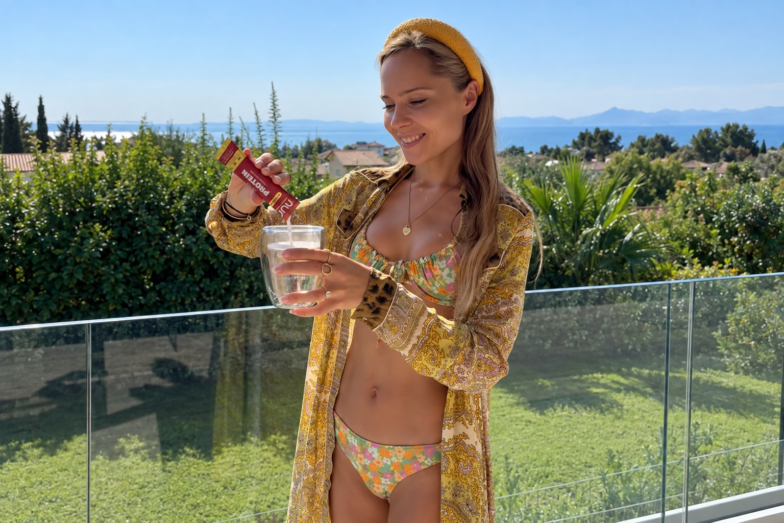
NUR makes clear protein with zero additives: light, gentle on the gut, and something you actually want to drink.
Co-founders Carolin and Lucy met in 2024 and bonded over one thing: they both wanted protein in their daily lives, and they both hated the way it came. Lucy grew up in an Ironman family. Carolin spent years fighting IBS and couldn't stomach the heavy, chalky whey shakes everyone swore by. They wanted protein that felt like water. It didn't exist, so in 2025 they built it.
From our first call, their packaging standards were as uncompromising as their formula.
The Challenge
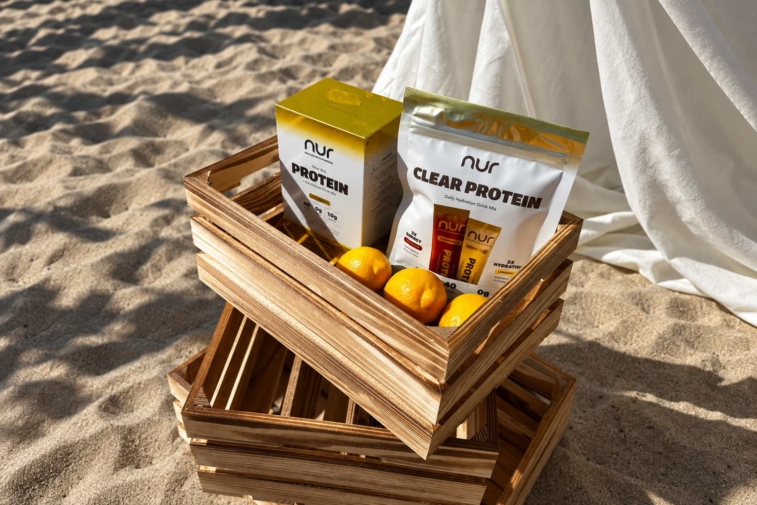
The key challenge was a soft gradient gold finish on the rigid box: a subtle transition from matte to metallic, reflecting the brand's balance of science and beauty.
Most suppliers said the finish was impossible.
The Process
We developed a unique approach using a metallized carrier and selective overprint to create that effect. After carefully filtering and testing multiple production partners, we found the precision needed for a stable, consistent gradient with the smooth glow the brand envisioned.
Building on that gradient-gold look, we paired the rigid box with a reinforced custom shipping box and tailored inserts to keep every unit secure in transit. We printed the consumer brochure on a premium paper stock to elevate the unboxing experience. With AI-powered packing optimization, we reduced freight volume while keeping full protection.
The Result
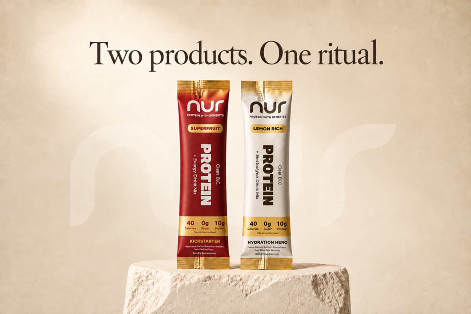
A complete premium packaging suite, from the gradient-gold rigid box to the custom mailer, the brochure and the shimmering stick packs, all built to NUR's exacting standards.
Together, we helped NUR cut total packaging and logistics costs by over 70% while delivering best-in-class packaging performance.
"Everyone else told us no. They asked what we were trying to make."

