

The Brand
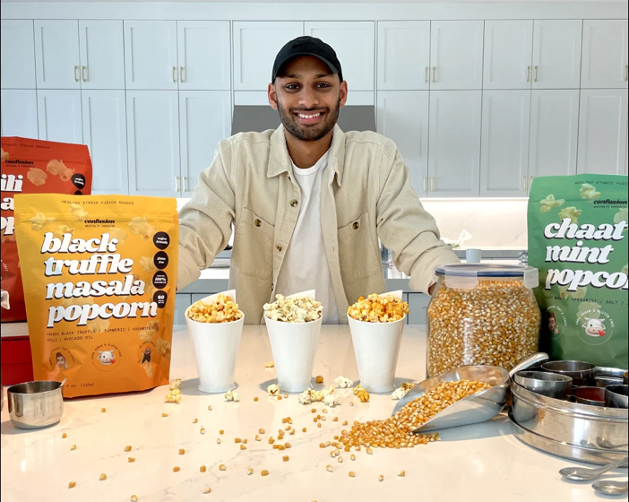
Aadit grew up between two worlds, accenting a western palate with Indian spices and shuffling between Bollywood and American pop. He wanted a snack that felt like that, not entirely American and not entirely Indian. That market did not exist, so he built it.
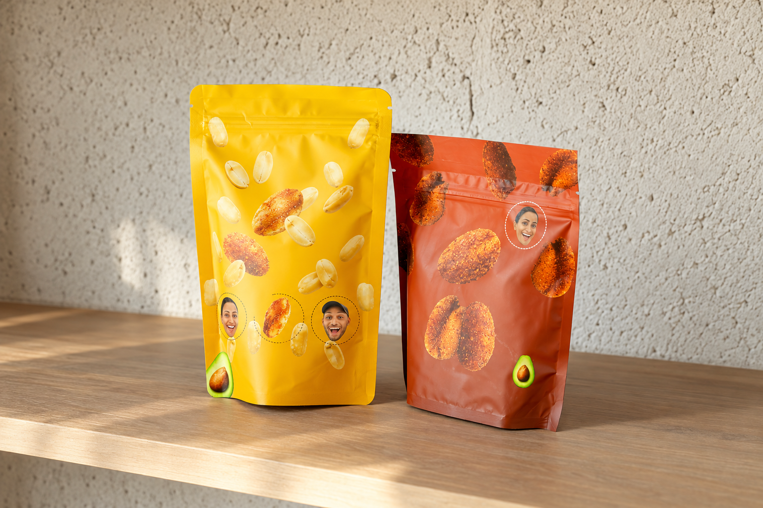
Confusion Snacks gives classic Indian street food a bold, modern twist, built on vibrant spices, heritage recipes and real crunch. The name is the whole idea, which means the packaging cannot be quiet. Aadit wanted the peanut illustrations to have a raised, tactile metallic quality rather than sitting flat on the film.
The Challenge
Getting that effect normally means spot embossing or foil stamping, both of which take weeks. Confusion Snacks did not have weeks. They had a launch date and no window for a physical sample run at all, which meant every decision about how the finish would look had to be made without ever holding it.
The Solution
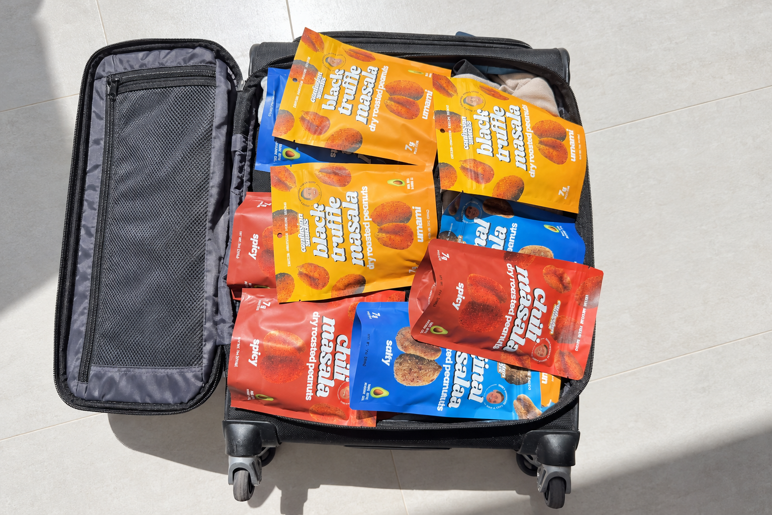
We used selective de-metallization, leaving precise windowed aluminum areas in the film structure, so the metallic sheen comes through the artwork itself. With no sample to judge it on, we ran press tests across a white ink opacity gradient from 30% to 100%, which let us tune exactly how much shine came through the peanut illustration before committing to the run.
For the color, we brought Confusion Snacks onto the factory floor by live video. Density, gradient shifts and surface finish were reviewed in real time under standard press lighting, with adjustments made on the spot.
Alongside that, we worked through the printing proofs repeatedly, down to the grid coordinates of the small heart icons. And when the order was packed, every pouch was stored with its opening flat and uncreased, so automated filling would run without a jam on arrival.
The Result
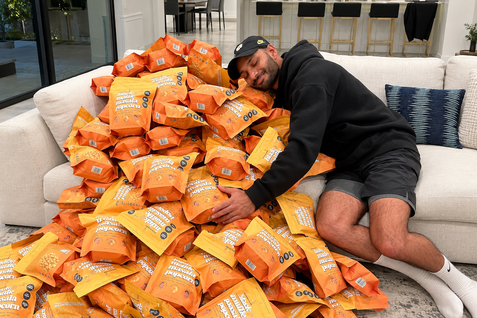
A pouch suite with the metallic relief they wanted, approved on color before the run rather than after it, and delivered inside a timeline that left no room for a second attempt.
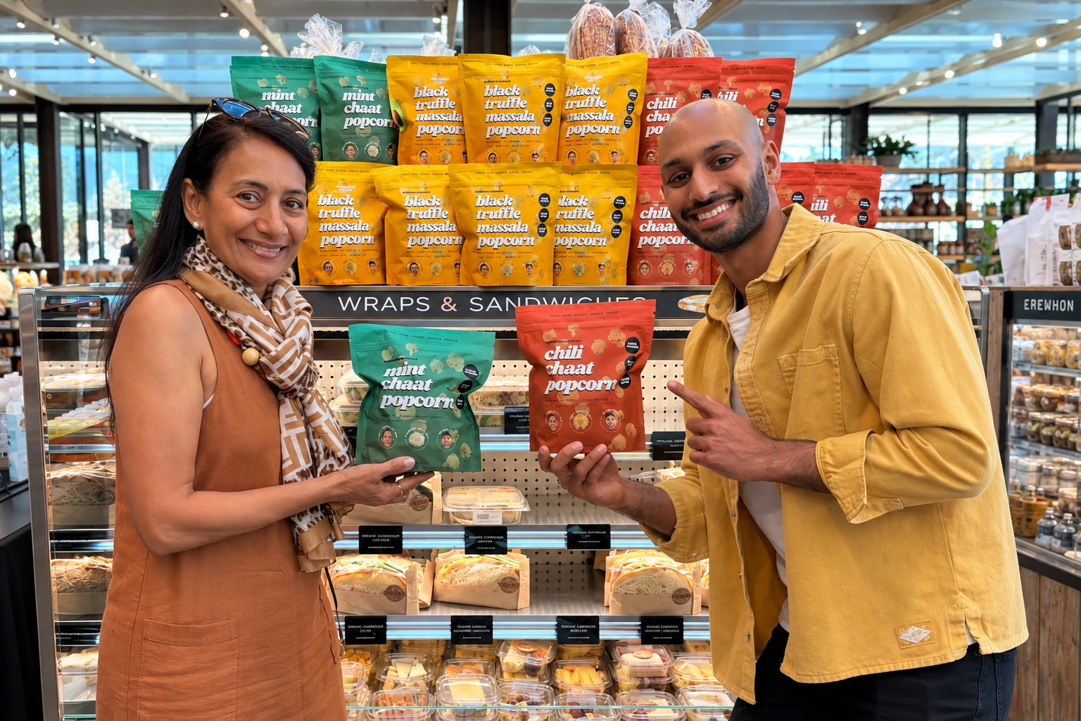
Aadit built this brand because nothing on the shelf sat between two cultures the way he did. A pouch that looks like everything else would have undone the point of it. We got the finish he described without a single sample to judge it on, and on a launch date that could not move. The peanuts catch the light the way he wanted, and the brand shows up on shelf looking like the thing he could not find.
"They were asking me about heart icons. I hadn't even noticed them."

