


Cost Reduction
Stronger board, 30% lower cost
Get $25 off your first order.Claim It →
— CK, founder of KOOK


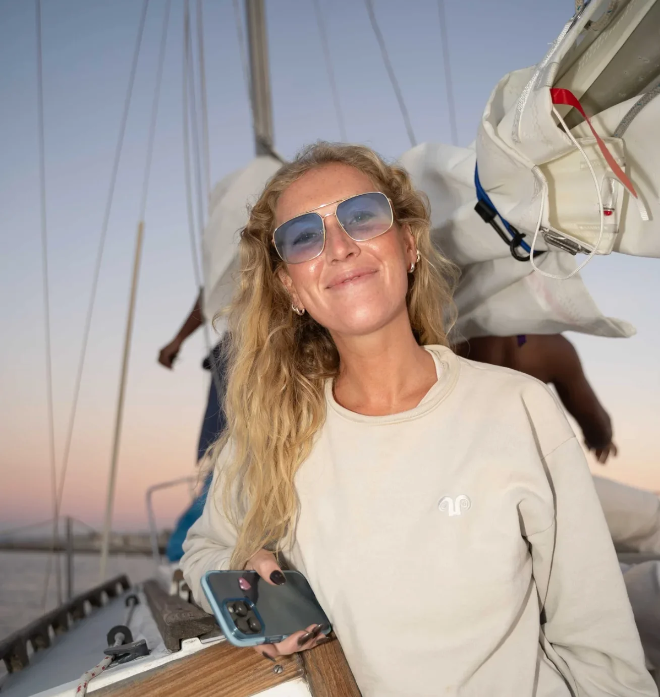
The story between KOOK and us
The first time I spoke with CK, we didn't talk packaging — we talked diving. Then she paused: 'Most cosmetics are basically toxic.' That conviction became KOOK, a hair & skin‑care brand for life in the ocean. While her vision was clear, execution became a quite confusing and expensive pursuit. Suppliers pushed 10K MOQs with costs that felt unfair for a small brand. After CK sent us her sample box, we set a goal: better feel, lower cost.
KOOK's brand color (Pantone 9064 C, a refined pale pistachio‑cream) left no room for error. We ran prints from eight experienced facilities in parallel for spot‑color matching, with instrumented checks under a light box and in natural light. Finishes can change perceived color and materials can shift depth, so when color and handfeel both need to be exact, they sometimes clash. Our approach is to lock the material, adjust the finish, and close the loop with one QC standard.
Result: thicker board, cleaner print, and an identical 9064 C color match, all while lowering total cost by ~30% and easing MOQs. Since then we've supported sachets, tins, and bottles, specifying the most sustainable materials feasible to honor KOOK's ocean‑first commitment.
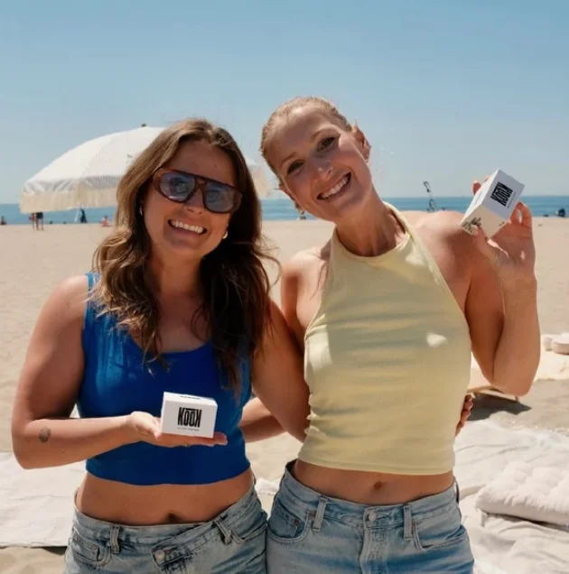
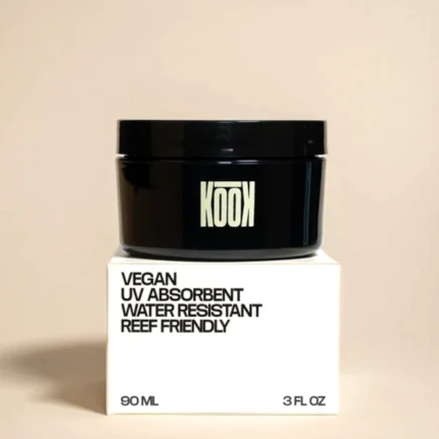
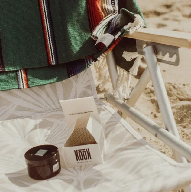
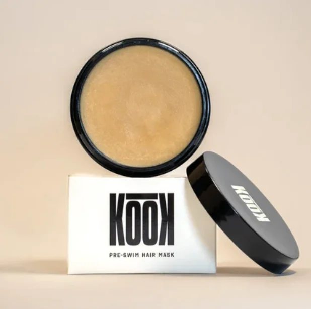
Stronger board, 30% lower cost
Precious Pantone 9064 C,
locked on every box
Print tests across 8 vetted facilities to find the perfect fit
Upload your dieline and we’ll show you what’s possible

